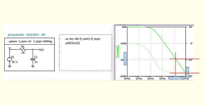
Hello, I would like to plot a vertical line @13Mhz on the plot attached. Does anyone know how to do this using the .plot directive?
You can do it like this:
- Copy bitmap to clipboard
- Paste it in schematics
- Draw graphical annotation → line
Best regards
@ivan1 You can do it like this:
1. Copy bitmap to clipboard
2. Paste it in schematics
3. Draw graphical annotation → line
Thanks ivan1, I have been doing something similar in power point. I would like to know if there is a way to do it with the .plot directive or some other programmatic way in Qspice.
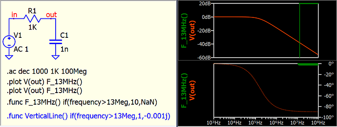
You can generate a vertical line with a function (e.g., the blue line in this example), but I believe this method might not be exactly what you are looking for. I assume that people asking this question want a way to place a horizontal or vertical line by simply providing a numerical value.
For the cursor, you can double-click its text box, type your value, and the cursor will move to the exact or closest position. You can make it land exactly on 13MHz by typing 13Meg and pressing enter.
Thanks @KSKelvin the .func option does the trick. Is there a way to not plot the phase of VerticalLine() ?
Are you referring disable phase axis? (right click phase axis, select no phase plot)
Or, you would like a vertical line in phase only plot? (as currently, this formula only plot a vertical line in magnitude plot)
This version allows for a line in both magnitude and phase, just as a concept, and its usage depends on your data range.
@KSKelvin I’m not sure what the function (.func F_13Mhz() if(frequency>13Meg,10,NaN)) is plotting but it looks like it is plotting on both the dB and angle axis. See the image, selecting the trace with a cursor indicates values on both dB (20dB) and angle (0deg) axis.
Any way, its not a big deal, the original question is answered. I am just showing what I see.
It is easier to explain what the function does by separate into magnitude and phase plot.
For .ac analysis, it plot complex data (R+jX) into phasor : magnitude and phase.
the function : if(frequency > 13Meg, 10, NaN) will give
- if frequency <= 13MHz : value is NaN (not a number)
- if frequency > 13MHz : value is 10 (i.e. magnitude is 10, phase is 0 degree)
When frequency <= 13MHz
NaN will not plot a value, therefore, in both magnitude and phase plot, you cannot see any data when frequency <= 13MHz.
When frequency > 13MHz
For magnitude plot, it will plot data with magnitude = 10 (i.e. 20dB). What interesting is that, Qspice can generate a vertical line when magnitude value jumps from NaN to this finite value.
For phase plot, it will plot data with phase = 0 degree. But unlike magnitude plot, it won’t give a vertical line with a value jumps from NaN to here. This is the reason why you see I give another example to plot with -0.001j, as it give start with magnitude 0.001 (-60dB) and phase -j (-180 degree)
If one day Mike removes this vertical plot, the trick of using NaN will not work. In that case, I must assign a value to generate a step curve. The concept of having this vertical line is essentially that of a step curve.
@KSKelvin I see, thanks for explaining. It’s a nice trick until someone fixes it.
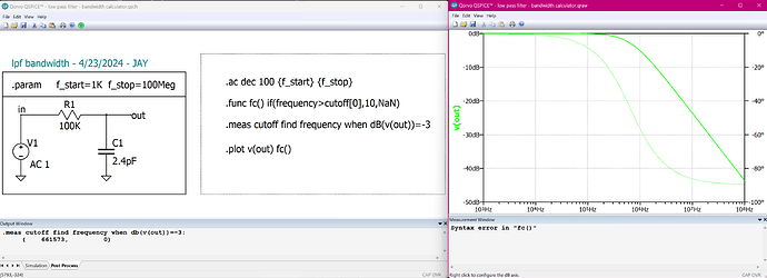
Hello, I’m back with another question. Continuing on from the above discussion. If you wanted to first calculate the cutoff frequency then plot it, can you do it Qspice or does Qspice need to know cutoff frequency before calling .func? I can calculate the cutoff but I cant plot it as a line on the plot. I would also be ok plotting a single large point at the cutoff on the v(out) trace.


