Hi @Engelhardt and Team
Any plan to add a spice directive to create XY-plot?
Background,
I wanna implement my own flavor of fra loop measurement which focused on system with long startup (so .step+.meas fra isnt applicable). I know how to export the data to a text file and plot it in excel. But i hope for something more convenient/easier.
Thanks
Arief
Mashashi San,
Well noted,
I will try it soon, after I have another laptop with python…
Arief,
1 Like
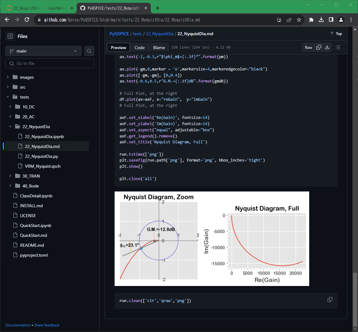
Please find this Nyquist diagram example.
The https://github.com/Qorvo/PyQSPICE module is updated to offer a gain-margin / phase-margin searching method.
This example needs version 2023.10.29 of PyQSPICE, please update it if you already installed from pip/pip3.
Making just a Nyquist diagram is very simple of one-line starting “df.plot()”!
Making a fancy-looking plot requires many lines… 
The concept of this Python interface is to record your routine/preferred operations in your script and reuse, and no need to type every time…or just use this example as is if you like it.
5 Likes