Classic GUI Interface Feature

Mike:

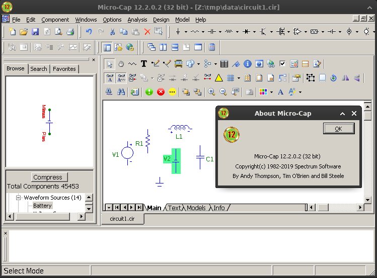
To be honest, I would prefer a more traditional GUI, similar to what was available in MicroCap 12.

A lot of people will have trouble accepting the new GUI approach you have created, and will likely not migrate from LTSpice for that reason.

How difficult would it be to offer a classic GUI interface as an option to be selected? Is this a major modification to QSpice program code or a minor tweak?

For a long time there was a program called “Classic Shell” that gave users the opportunity to make their desktop look more like a traditional Windows environment.

In a similar way, I think there are good reasons why the GUIs used in other CAD programs have not changed much over the last 20 years.

Summary

This text will be hidden

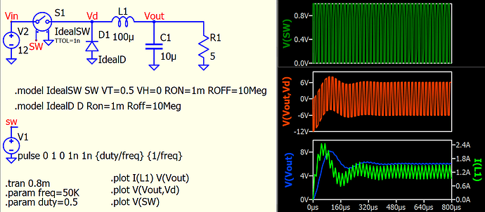
QSPICE GUI simple and very easy for study.
I personally hate GUI with hundreds buttons like MC12.

Rhino

The request was to make the Classic GUI as an option to be selected. If you like the simpler GUI as is, you would not have to engage the classic GUI.

I understand many like the buttons and are very vocal about it. I can offer my sympathy.

But entertaining two GUIs is very unappealing. I try to just look at the fundamentals, design a GUI on those, implement that and see how that GUI feels. At this point I can’t go backward in time to the toolbars.

But you have my empathy.

–Mike

1 Like

What do you mean about “Classic GUI”? MC12?
There a lot of GUI that can be named “Classic”. LTspice, OrCAD (DOS, Windows)…
Most known GUI probably is MS Word. Should Mike use MS design?

P.S.
Theoretically you can write own GUI and call QSPICE64.exe for simulation.

1 Like

I think the possibility of a small, customizable toolbar (perhaps just with the option of enabling the components - or the tools that the shortcut keys point to) is interesting. But I understand that the proposal is disruptive.

My big problem with toolbar buttons is a matter of fundamentals:

  1. They force the user to move the mouse all the
    way over to the button, press it and then move
    it all the way back.
  2. The user has to shift their eyes away from the
    content of the simulation.
  3. Toolbar button take up screen space that is
    better used for a bigger view of the content
    of the simulation.

When I watch a expert user of some application with lots of GUI with toolbar buttons, they are energetically swatting at the the computer and darting their eyes all over.

This view point has been reenforced by the feel I get when I use toolbar buttons vs context menu commands.

–Mike

You can observe a lot just by looking.

2 Likes

Mike:

I think the issue is more about user choice and user personal preference rather than one person deciding what is uniformally “best” or “most productive” for everyone.

It’s one of the reasons Windows gives you “six-ways-from-Sunday” for doing the exact same thing.

People then customize their desktop experience so that it works best for them.

For me, I usually turn off/remove the excessive tool bar clutter, if I don’t need it.

Windows PC’s are called “personal computers” for a reason…

I think the issue is more about user choice and user
personal preference rather than one person deciding
what is uniformally “best” or “most productive” for
everyone.

Well, that is certainly the sort of sentiment that everyone would like to be able to agree on, but I’ve had life experiences that have taught me that GUI design has little to do with users’ preconceived preferences.

By the end of the 1990s, I had been writing charged particle optic simulators for some while on a large Sun cluster. I moved on from that secretive(aside from the occasional peer-reviewed article when asked for for hard core technical promotions) work to do LTspice because I had had enough contact with the original Berkeley CAD developers to know I could do a better SPICE.

But I didn’t know if I was going to be able to type it in. A decade of EMACS Ctrl- commands had done enough damage to may hands I didn’t know if I could type any more or not. Fortunately the Windows GUI for text was better than that under UNIX and didn’t need Ctrl- commands.

Ergonomics are more important than my(or anyone else’s) preferences.

The other reinforcement that ergonomics trumps preconceived user preferences was the study I did of CAD users during the design of the LTspice GUI. They had weird vertical mice or some other strange thing because CAD software had done so much damage to them. I was required to make a GUI that did less damage. The only reason LTspice had a toolbar was to give it some visual interest in a magazine placement. Everyone knew not to use it.

When it comes to GUI design, one needs to look at the fundamentals. Set preferences aside. More often than not, preferences are just baggage some some older GUI.

Yes, it goes against the flow to discard, with passion, any preconceived ideas of what a GUI should like like. And it’s not fun giving people what is good for them instead of what that want. But, ultimately people don’t know what they want until you show it to them. That is why Micro-Cap/Spectrum Soft is out of business and I am not.

–Mike

2 Likes

Mike:

I had no clue that biometric / health issues would
intrude into this topic of discussion.

At the risk of appearing “obstinate” in the face of all
argument, let me offer the following response.

If the argument against a GUI interface with tool bars is HEALTH DRIVEN, then the CAD software companies that offer products with extensive tool bar menus should all be held liable in a class action lawsuit for creating “injurious products”.

Clearly, some health warning should have been posted as to “the dangers of using tool bar menus”.

Please understand: I am 66 years old. I have been using
Windows and CAD software for a very long time.

However, I do not have issues with:

1)  Carpal Tunnel Syndrome
2)  Damaged joints
3)  Damaged cartiledge
4)  Nerve damage
5)  Arthritic pain
6)  Any other medical conditions impacting 
      finger, hand, wrist, elbow, or other joint 
      or nerve conditions limiting my ability to 
      use a computer.

It could be argued that I have been “lucky”.

However I would also attribute my lack of “damage”
to proper nutritional support, allowing my body to repair itself from the normal wear and tear issues associated with living over many years while doing computer work.

So, for me, arguing that tool bar menus should be eliminated on “Health Grounds” is a non-starter.

I make my own health decisions when it comes to using a computer. I take responsibility for my own health, rather than put the blame on software or computer hardware manufacturers.

Again: At issue here is personal choice and autonomy in making GUI setup decisions rather than having them pre-made by someone else who feels they “know better”.

If a software manufacturer needs to display a health
warning statement as to the risks involved in engaging “tool bar features”, then so be it.
1 Like