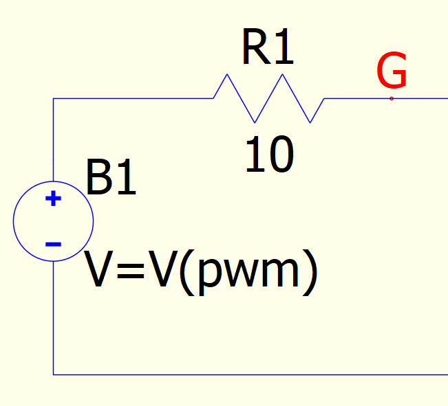
There is a small irregularity in the display of a B-source when you zoom out. Here is the image up close:
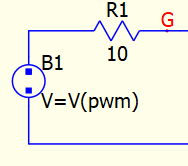
The other image needs to go in the next post.
There is a small irregularity in the display of a B-source when you zoom out. Here is the image up close:
The other image needs to go in the next post.
The + and the minus do not scale well in zoom.
The ‘+’ and ‘-’ are done as rectangles. They look very nice on my monitor. You can define your own symbols. You’ll want to become good at making symbols anyway:
–Mike
OK, I looked into this more and was able to make an improvement that should look better on all monitors. You’ll have to delete the existing B-sources and add them back. New schematics will simply enjoy the improved rendering.
That looks much better!